Cornhole — studio treatment concept
Cutting Edge Graphix · first generated pass · 28 August 2026
Read this first: the artwork below is not yours.
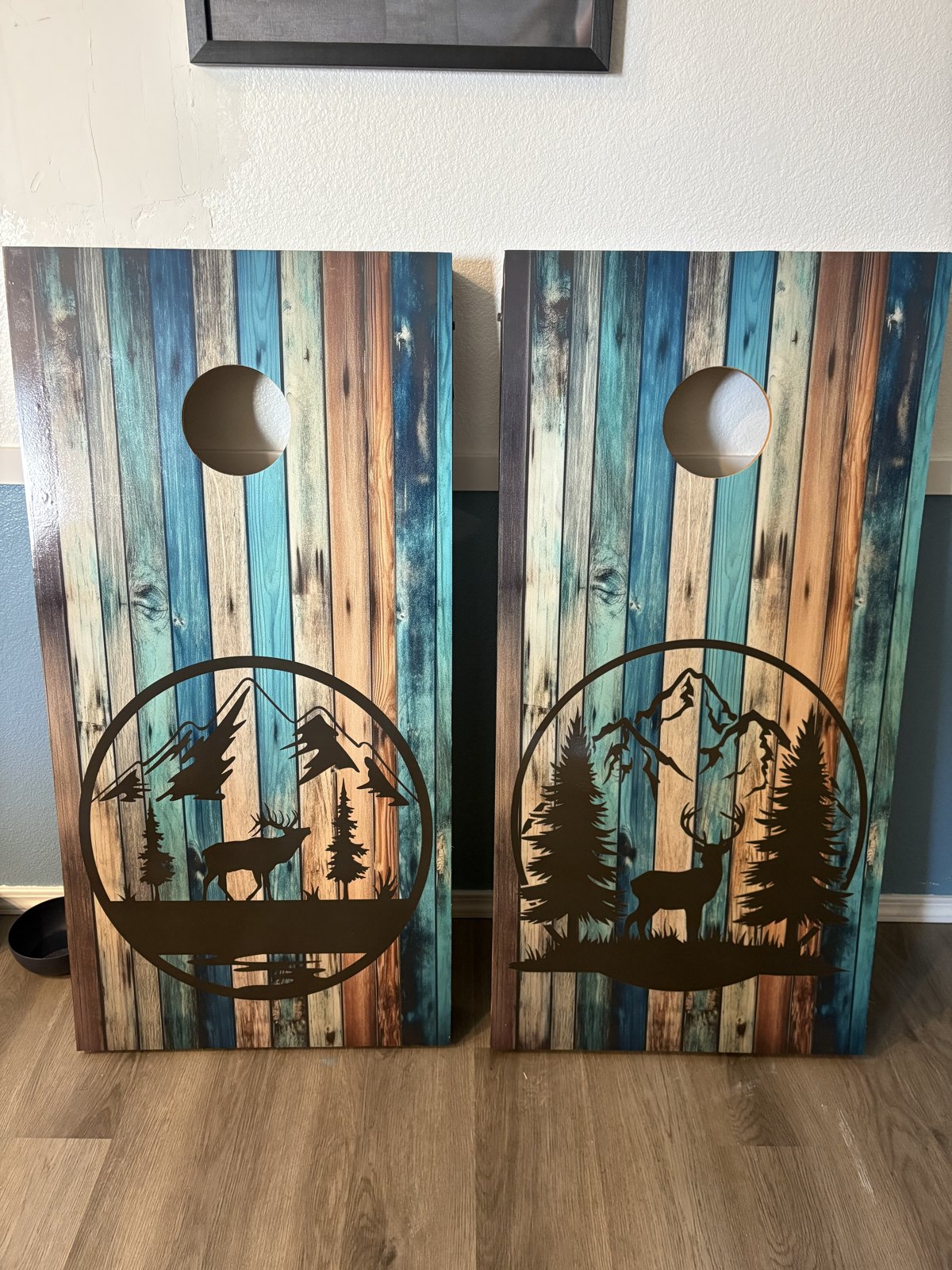
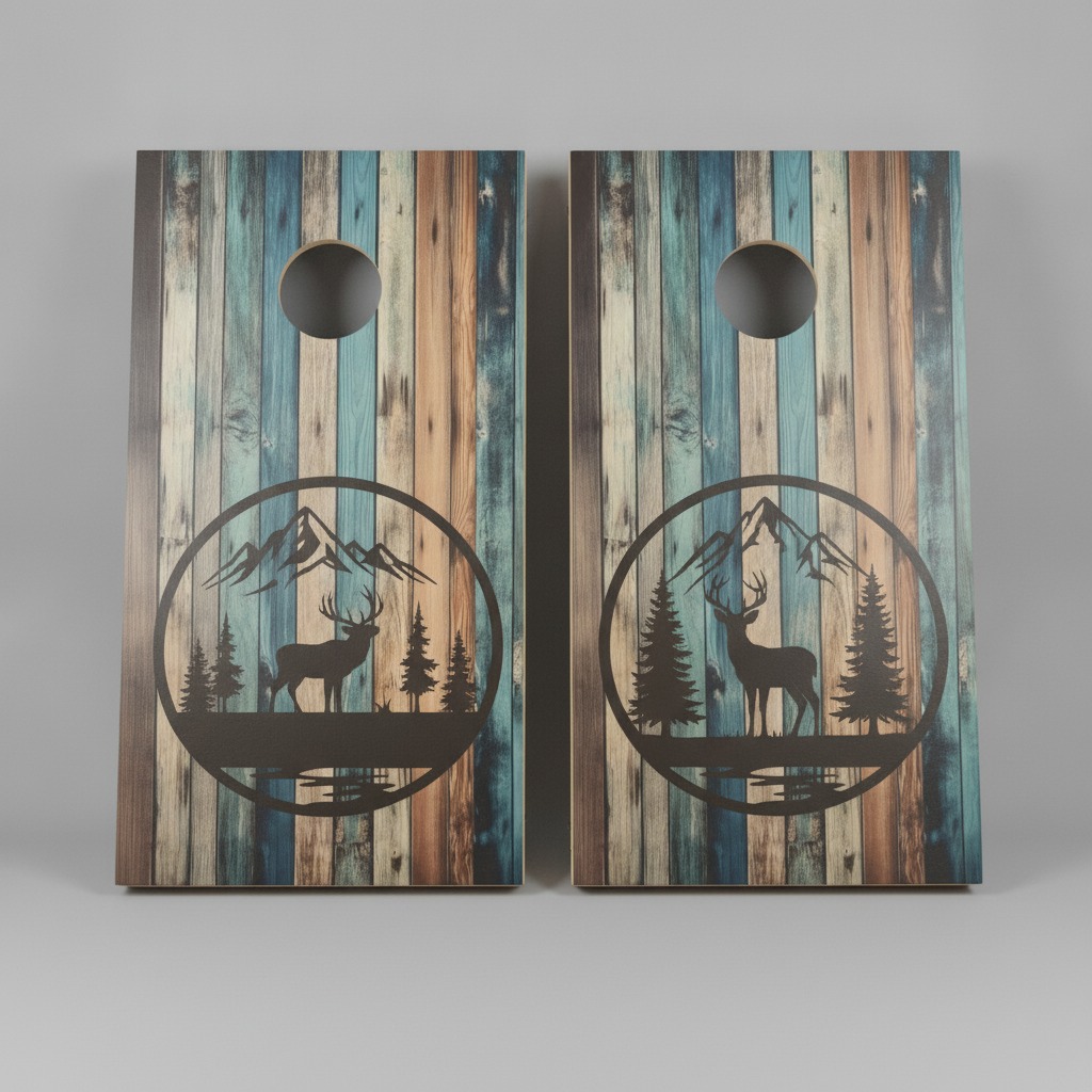
We fed the pipeline a photo of your boards and asked it to produce a studio product shot.
It cannot copy a design from a photograph — it re-draws what it sees. The wood, the lighting
and the staging are the point of this page. The emblem it drew is a
placeholder, not your design. Your real artwork goes in once we have the design files.
Where we are
What the render got right
- The toss hole is a real opening — you can see the backdrop through it, not a painted circle. This is the hardest part of rendering a board and it worked.
- Board form and proportion are correct — a true 2ft×4ft face with visible panel thickness.
- Print realism reads as printed wood, not a flat graphic.
- The distressed plank finish is close — teals, blues and warm tans running vertically down the board, matching your boards.
What is wrong, and why we are not listing it
- The emblems are invented. They are a plausible elk-and-mountains motif, not your artwork — the detail and line weight are simplified against the real thing.
- The two boards should not match. Your set carries a different emblem on each board — the left one a bugling elk with a water reflection. The render put near-identical deer scenes on both, losing the left board’s design.
- The boards lean like signage. They should stand square to the camera.
- Background is grey, not the pure white a marketplace listing needs.
Nothing here is listed or for sale. No product page, no catalogue entry — this is a look at the treatment only.
- Send the artwork files for the designs you want listed. With real files the emblem is placed exactly, not redrawn, and the result is your board rather than an impression of it.
- Tell us if the staging is right — white background, straight-on, both boards in frame. That part we can settle now, independently of artwork.
- We fix the lean, the background and the plank direction on the next pass regardless.